
Document Visual Language
Document Visual Language
- Last updated
- Aug 3, 2026
- Relationships
- 6
Mental model
Working model: themes assign values to shared tokens; components and patterns apply those decisions consistently.
Visual memory card
The pattern, in one image.
A compact visual makes the pattern easier to recognize when it appears in a different example.
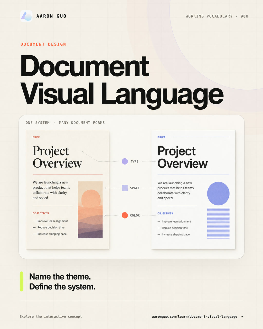
01 · Working document-design model
Switch a theme. Inspect the same document.
This simulator separates local themes, documented design traditions, and established design practices. Every visual mapping remains this site’s interpretation.
Document purpose · examples
Report, proposal, manual, and essay are practical examples for this simulator—not a universal document taxonomy.
Preset library · 12 starting points
Choose a sourced tradition, an established practice, or a clearly labeled local theme.
What changed in the business?
Revenue grew, but review capacity became the constraint. The document should make the bottleneck visible before it celebrates output.
The bottleneck moved from generation to judgment.
| Generate | 2.4× faster |
|---|---|
| Review | 1.1× faster |
| Rework | +16% |
Local tuning controls
These four axes make review feedback more specific; they are not a published standard.
A product-local theme: calm, tactile, and approachable.
Contrast guardText colors are held above 4.5:1 on their surfaces · 4.52:1
Alder: warm, soft, sparse, and rhythmic.
Export the design-system decisions
The current choices compile into a readable document-design brief and a machine-readable token manifest.
Document design brief
# Document Design Brief

> Working model, not a formal standard.

## Document purpose
Analytical report — Scan evidence and compare performance

## Design context
- Historical design tradition: Classical book typography
- Design practice: Editorial design
- Current theme or starting point: Alder

## Local tuning axes
- Temperature: 22/100 (warm)
- Geometry: 28/100 (soft)
- Density: 35/100 (sparse)
- Expression: 48/100 (rhythmic)

## Core tokens
- Paper: #f0e4ca
- Ink: #30382d
- Muted text: #665d4c
- Accent: #6a5c3f
- Radius: 18px
- Spacing: 22px

## Component rules
- Prioritize retrieval, comparison, and stable data rhythm.
- Use soft geometry, sparse spacing, and rhythmic hierarchy.
- Text colors are held above 4.5:1 on their surfaces
02 · Teaching sequence
A theme sits inside a larger system.
This five-step sequence is a teaching model, not a standard taxonomy. It keeps purpose, sources, implementation, and reusable behavior distinct.
- 01Document purposereader task
- 02Design traditionhistorical source
- 03Design practiceprofessional method
- 04Themenamed implementation
- 05Tokens + components + patternsreusable behavior
03 · Evidence labels
Every name should state what kind of claim it makes.
The library separates product-local names, documented historical traditions, and established fields of practice.
Local themes
Product-specific names for declared token and component decisions. Alder and Granite belong here.
Historical traditions
Documented movements or typographic traditions, shown through contemporary interpretations.
Design practices
Established professional fields such as editorial design, information design, and technical communication.
This simulator is a local teaching model. DTCG 2025.10 is a stable W3C Community Group Final Report, not a W3C Standard, and every historical mapping shown here is a contemporary interpretation.
Artificial Intelligence (AI) can generate Portable Document Format (PDF) reports, proposals, manuals, and learning materials in seconds. The difficult part often begins after generation:
- Make it more professional.
- Keep it warm, but not casual.
- Make it feel editorial without losing analytical clarity.
These reactions contain judgment, but not instructions. A designer, developer, or model still has to guess which typography, grid, density, color, or component should change.
Terminology note: “Document Visual Language” is a working umbrella term used in this article, not a formal standard. The model below uses established design-system concepts—theme, design token, style, component, pattern, and accessibility criteria—and labels every local teaching device as such. The Design Tokens Community Group’s 2025.10 format is stable and intended for implementation, but its own status section says it is not a W3C Standard.
This article asks a practical question: how can a team translate document intent into repeatable themes, tokens, components, patterns, and review criteria?
A room name is not a construction drawing
An interior designer may call two room concepts Alder and Granite.
Alder suggests timber, natural light, soft materials, and warmth. Granite suggests stone, order, weight, and cool neutrality. The names are excellent choice interfaces: people remember them and can express a preference quickly.
A construction team still needs plans, dimensions, materials, lighting temperatures, and acceptance criteria. “Make it more Granite” is not enough to build the same room twice.
Document themes work the same way:
| Layer | Room analogy | Document equivalent |
|---|---|---|
| Theme | Memorable room name | Alder or Granite |
| Design tradition | Historical reference | International Typographic Style or New Typography |
| Design practice | Professional discipline | Editorial design or information design |
| Design tokens | Material schedule | Named colors, dimensions, type roles, and spacing |
| Components + patterns | Installation details | Tables, quotations, warnings, headers, and footers |
Poetic naming creates an image. System definition makes the image reproducible.
A five-step teaching sequence
This sequence is a local teaching model, not a formal taxonomy.
1. Document purpose: what outcome does the reader need?
A long essay supports continuous reading. An analytical report supports scanning, comparison, and evidence retrieval. An operating manual supports accurate action under pressure. A proposal supports a decision.
Purpose comes first because visual taste cannot overrule the document's job. OASIS DITA formalizes information types such as concept, task, and reference for technical content. Report, proposal, manual, and essay are broader practical examples in this simulator, not DITA categories.
2. Historical design tradition: which documented source are we borrowing from?
A historical design tradition names a traceable source:
- Swiss Style or International Typographic Style uses disciplined grids, sans-serif typography, asymmetry, and photography.
- New Typography treats the page as a field of asymmetric type and image relationships.
- Classical book typography organizes proportion, margins, and quiet text color around sustained reading.
A tradition provides references and relationships. It is not a template button, and the simulator’s rendering is not an authoritative reconstruction.
3. Design practice: which established field guides the work?
Editorial design, information design, technical communication, book design, and minimalist graphic design are recognizable fields or practices. They are broader than a theme and do not form one universal classification system.
4. Theme: what memorable name identifies this implementation?
A theme preset packages one implementation:
| Theme | Declared mapping |
|---|---|
| Alder | Classical book typography + editorial design |
| Granite | International Typographic Style + information design |
This mapping is a working interpretation, not an industry standard. Another product can use the same name differently.
5. Design tokens, components, and patterns: how does it remain consistent?
Design tokens store exact values such as primary ink, paper color, heading family, body size, section spacing, or rule thickness.
Components package reusable parts; patterns explain how parts work together for recurring needs. Local component rules preserve document-specific relationships:
- When may a table use a filled cell?
- How do quotations and warnings differ?
- Are images full bleed, cropped, or constrained to the grid?
- May data pages be denser than narrative pages?
- Where do sources, page numbers, headers, and footers live?
Tokens preserve named values. Components and patterns preserve repeatable behavior. A working document system needs both.
Four axes make taste discussable
Temperature, geometry, density, and expression are this article’s review controls. They are not standardized design-system axes, and the 0–100 values are not measurements. Their purpose is to make a direction and relative intensity explicit.
Adjectives become more useful when a direction and intensity are attached:
| Axis | Left | Right | Common controls |
|---|---|---|---|
| Temperature | Warm | Cool | Paper tone, palette, type character, image light |
| Geometry | Soft | Hard | Corners, rules, weight, shapes, boundaries |
| Density | Sparse | Dense | Type size, line length, whitespace, columns, table rhythm |
| Expression | Restrained | Expressive | Scale contrast, color count, image ratio, composition change |
Instead of “make it more premium,” a review can say:
Keep the cool temperature and hard geometry. Reduce density from 70 to 50, increase expression from 25 to 40, enlarge the title contrast, and keep one accent color.
Taste remains involved, but the next iteration now has a direction.
A source-aware vocabulary
| Name | Evidence label | Useful context | Typical failure |
|---|---|---|---|
| International Typographic Style | Historical tradition | Information reports, institutions, multilingual material | Helvetica without grid discipline |
| New Typography | Historical tradition | Posters, covers, exhibitions, manifestos | Every page becomes dramatic |
| Bauhaus typography | Institutional legacy | Exhibitions, cultural publishing, geometric information | Primary colors and circles used as costume |
| Art Deco | Historical movement | Hospitality, architecture, covers, event material | Ornament overwhelms hierarchy |
| Art Nouveau | International style | Cultural, botanical, craft, and heritage narratives | Decorative curves reduce readability |
| Classical book typography | Typographic tradition | Essays, history, policy, literature | Tiny type and fake antique decoration |
| Editorial design | Professional practice | Magazines, annual reports, brand narratives | Random layouts mistaken for rhythm |
| Information design | Professional practice | Reports, public information, complex comparisons | Correct but entirely forgettable |
| Technical communication | Professional field | Specifications, audits, manuals, research records | Density mistaken for professionalism |
| Minimalist graphic design | Professional practice | Product briefs, portfolios, focused reports | Emptiness mistaken for hierarchy |
These labels still do different jobs. Historical traditions provide sources; professional practices describe fields of work; Alder and Granite remain product-local theme names.
Compile Granite into a real brief
Suppose the task is a 24-page quarterly operating report.
Communication intent
- Reader feeling: stable, credible, reviewed.
- Reader action: read the executive summary, scan the metrics, then retrieve evidence.
Design context
| Layer | Decision |
|---|---|
| Purpose | Analytical report |
| Tradition | International Typographic Style |
| Practice | Information design |
| Theme | Granite |
Coordinates
- Temperature: 78% cool
- Geometry: 72% hard
- Density: 64% dense
- Expression: 24% expressive
Token recipe
- Cool-white paper and graphite ink
- One slate-blue accent
- Neutral sans-serif headings
- Readable serif or humanist sans-serif body at 10.5–11 points
- Twelve-column grid with a stable table rhythm
- Zero-to-four-point corner radius
- Thin rules with enough contrast to survive printing
Component rules
- The executive summary may use one large number; data pages do not repeat a cover effect.
- Tables rely on alignment, spacing, and limited horizontal rules rather than boxing every cell.
- Risk uses text, symbol, and color together, never color alone.
- Headers, footers, sections, and sources stay predictable.
Granite has now become testable. The name is still memorable, but it no longer carries the specification by itself.
When this model helps
- A template or AI system repeatedly generates reports, proposals, manuals, or learning material.
- Designers, writers, developers, and models must exchange visual intent.
- One brand supports several document genres.
- Reviews repeatedly use vague language such as professional, lively, or premium.
- Themes need to be searchable, comparable, versioned, and tested.
When it is too heavy
- A one-time internal notice is already clear in the default template.
- Content and evidence are unstable, so visual classification is premature.
- No one will reuse or maintain the theme.
- The main problem is wrong content or broken information structure.
- A mature brand system already defines the necessary decisions.
Failure signals
- Poetry without specification: the name is memorable, but every implementation is a guess.
- Style soup: Swiss, warm, brutalist, luxury, minimal, and dense are requested without priority.
- Fashion before function: an operating manual receives unpredictable magazine layouts.
- Token theater: hundreds of values exist, but reader tasks and component behavior remain unclear.
- Alias drift: different teams use Granite for unrelated designs.
- Accessibility laundering: low contrast, tiny type, or broken reading order is defended as a style.
Visual style cannot replace semantic structure. Accessible PDF also depends on headings, paragraphs, lists, tables, reading order, and real assistive-technology testing.
Know the neighbors
- Document purpose describes the reader outcome. Formal information types exist in specific systems such as DITA; the simulator’s four purposes are examples.
- Historical design tradition identifies a source. It supplies traceable references without becoming a ready-made theme.
- Design practice describes a professional field. Editorial design, information design, and technical communication belong here.
- Theme is a named implementation. It coordinates token values for a product or context.
- Design tokens are named implementation data. They express design decisions in a platform-agnostic format but do not choose the strategy.
- Components and patterns carry decisions into use. Components package reusable parts; patterns describe recurring solutions and contexts.
Remember these six things
- “Document Visual Language” is this article’s working umbrella term, not a formal standard.
- Start with document purpose, then identify a historical tradition or design practice before naming a local theme.
- Treat the four axes as local review controls, not standardized measurements.
- Themes assign coordinated values; design tokens name and exchange those decisions.
- Components and patterns apply decisions consistently across recurring document needs.
- Style never substitutes for content structure, evidence, semantics, or accessibility.
Self-test
- Is the reader continuously reading, scanning evidence, following steps, or making a decision?
- Is the current label a documented tradition, an established practice, or a product-local theme?
- If the theme name disappears, can the team rebuild it from tokens, components, patterns, and rules?
- Which axis and components should move when someone asks for “more professional”?
- Which rules stay stable across a cover, a narrative page, and a data page?
- Does the design survive printing, long reading, low-quality screens, and assistive technology?
Further reading
- Design Tokens Community Group · Design Tokens Format Module 2025.10
- GOV.UK Design System · Styles, components and patterns
- Material Web · Theming
- OASIS DITA 1.3 · Information typing
- Cooper Hewitt · A Harmony of Contrasts
- Museum of Modern Art · The New Typography
- Bauhaus-Archiv · Bauhaus Typography
- World Wide Web Consortium · Web Content Accessibility Guidelines 2.2
- PDF Association · ISO 14289-1 / PDF/UA-1
Relationships
Concept neighbors
Document Purpose
content intentDocument Purpose / Information Type
Describes the reader outcome. DITA concept, task, and reference are standardized information types; the simulator uses broader practical examples.
Design Tradition
historical sourceHistorical Design Tradition
Names a documented movement or typographic tradition such as the International Typographic Style or New Typography.
Design Practice
professional fieldDesign Practice
Uses established fields such as editorial design, information design, and technical communication.
Theme
named implementationDesign Theme
Assigns a coordinated set of values to shared design roles for a product or context.
Design Tokens
implementation dataDesign Tokens
Store exact colors, sizes, type roles, and spacing values; they do not decide the document strategy.
Components and Patterns
reusable behaviorComponents and Patterns
Components package reusable interface parts; patterns explain how to combine them for recurring user needs.
Evidence trail
Primary sources
- Design Tokens Community Group · Design Tokens Format Module 2025.10
- GOV.UK Design System · Styles, components and patterns
- Material Web · Theming
- OASIS DITA 1.3 · Information typing
- Cooper Hewitt · A Harmony of Contrasts
- Museum of Modern Art · The New Typography
- Bauhaus-Archiv · Bauhaus Typography
- Victoria and Albert Museum · An introduction to Art Deco
- Victoria and Albert Museum · Art Nouveau — an international style
- World Wide Web Consortium · Web Content Accessibility Guidelines 2.2
- PDF Association · ISO 14289-1 / PDF/UA-1